Let’s explore the notion of “white space,” aka “negative space.” The phrases are used interchangeably.
First, we need to be clear that “negative space” is not negative in the sense of its being “bad” in any way. Not a pejorative in the least, the term “negative space” is used in the arts to refer to the spaces around and between the elements of a composition. A classic drawing class exercise is to ask the students to draw a still life by drawing the spaces between the objects rather than the objects themselves. This exercise helps enhance the awareness of the power of white space.
Just as a pause in speaking adds impact, so it is with a visual “pause” of white space in a composition.
You don’t have to have a … William Shatner … style … of … delivery for pauses to be effective.
The key is to deploy the technique of the artful pause mindfully and deliberately. One manifestation that’s in fashion (as all trends are) with respect to copy writing and in peril of overuse is the —
Single. Word. Sentence.
White space in a layout, composition, or in sculpture or architecture —
- Creates a visual “pause” that relieves viewing stress.
- Is effective for focusing and directing attention to what’s important.
- Is an “antidote” to visual “noise,” aka clutter.
There is such a thing as actual fear or suspicion of white space, or openness, called horror vacui, or – in its psychological extreme – kenophobia. Horror vacui is defined by the Oxford English Dictionary as “A fear or dislike of leaving empty spaces, especially in an artistic composition.”
The absence of white space in design does not mean covering every square inch of the layout’s available space like a dollar-store circular. There is a balance that comes with experience.
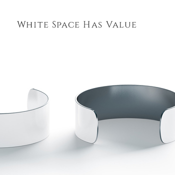
Because It Expresses Value
In print design as well as web design, white space creates an experience of quality. White space, and its close ally, asymmetry —
- Can be quiet and powerful, its impact being understated and restrained, which causes the viewer to pay closer attention.
- When properly balanced with content can convey drama and a sense of sophistication, luxury, and by extension, a perception of value.

Isn’t Necessarily White
White space refers not only to open areas of white or pale color, but to any open area in a composition, which can be of any color, a texture, or even a background that’s open and uncluttered. For the latter, think of a composition in which a solitary figure is set in a vast expanse such as a landscape or ocean view. People stop to look at this, as the composition radiates stillness, reflection, or a dramatic pause.
In the fine arts, the most abundant and impressive employment of white space can be seen in the work of the Minimalists. In theater or in film, the corollary to white space is a minimalist setting, or an actor who pauses or speaks in a low voice. Famed British actor Oliver Reed when asked about the secret of his particularly menacing portrayal of Bill Sikes in the film Oliver! pointed out that he deliberately spoke in a very low voice as a way to enhance the intimidating presence of the character. Think of the impact of this and you will know the effect of white space, stillness, as visual “low volume” in the arts as well as in design.
The diametric opposite of white space is busy-ness, loudness, clutter — filling the visual field with strong pattern, details, or other visual “goings-on.” This includes heavily animated images that flash and gyrate, or fast-cuts in a scene. Of course these devices can be used to potent effect if that is the desired effect. But if it’s not, then white space can be used with confidence.
The “moral of the story” is — do not fear or suspect white space as “a waste of space.”
Quite the contrary is true.