As a designer, I have been working with typography for years, and “font psychology” has been a factor in my work since long before this particular phrase became popular to describe it. Since the very beginning, typefaces (to me) have always had personalities — “voices” if you like.
Most of the writing about typefaces starts with a discussion about the classic groupings such as serif, sans-serif, slab serif, script, display, novelty, and the like. And many have the basic variations of italic, bold, condensed, etc. There are dozens of words used to characterize typefaces by both their formal visual attributes and “technical” terms to describe their components.
What Is Usually Meant by “Font Psychology”
On an emotional level, “font psychology” refers to the formal visual characteristics that affect how the words set in a particular typeface are perceived by the reader. These characteristics are separate from — but in the best cases in harmony with — the actual content of the texts for which they are chosen. Typefaces are perceived subconsciously as strong, or elegant, or active, or casual and such. Typefaces can be many things. They can be kids-fun, rebellious, retro, dignified, rollicking, academic, friendly, formal, funny, graffiti-evoking, flowery, elegant, spooky, futuristic … you name it! All of these elements combine to affect how the reader feels and to evoke certain feelings and associations that are better achieved when deliberate than accidental.
Other Dimensions that Affect Typographic Choices
For me, there have always been at least two other axes along which fonts are considered (I call it “auditioned”) for a particular use. One of these is the dimension of what I call “historicity.” That is, many typefaces reflect the era from which they originated or bear a specific stylistic aspect that bespeaks or evokes an era or culture. There can be unwanted aspects to this in which a typeface can come across as “dated” rather than serving the real mission. Given my knowledge of art history, with typography, I certainly do recognize very often the era “of which they speak.” As a result, certain typefaces can come across to my eye as looking Euro-ancient, primitive, or retro. They can “shout 60s” or “diner” to me, or look futuristic, medieval, art deco, Victorian, or (literally) ancient Roman. They can also have characteristics reflecting various world cultures, or appear otherwise geographically “regional.”
The second “axis” is legibility. Legibility is a crucial factor in selecting typefaces for specific purposes. Sometimes legibility is less important than expression, and when that’s the case, it’s appropriate to decide accordingly. Every case is unique (pun intended). A hard-to-read block of type can be off-putting. An eminently legible block of type is physically relaxing, open, and welcoming to the reader. Typographic choices are best when they serve in all three dimensions: personality, or “voice,” cultural or historical factors, AND in legibility. And we haven’t even mentioned color!
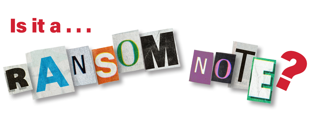
Loads of ink and pixels have been expended on discussions about and advice regarding the pairings of typefaces and the choices designers make to typeset text content as headlines, subheadings, paragraph text, etc. in a design. These elements are key to guiding the reader through the content and have huge impact on how the text’s content is perceived and understood. The typical advice is not to use more than two or three different typefaces in a design, lest the work suffer from being a product of what I call the “Ransom-Note School of Typography.” And, well, this is true unless of course you’re designing a piece to LOOK LIKE a ransom note! That’s a matter of appropriateness, and that can be formally visual or cultural.
Typography is a massive field, and since moveable type was first invented there have been thousands and thousands of typefaces designed over the centuries. For designers today, the choices are dizzyingly limitless.
To bring us back to the present and the immediate, I love working with typography and if I were to boil it down to the essentials, I suppose my work consists of creatively combining words and pictures. And the letterforms which depict the words are at the heart of the matter.
When I look for typefaces to use in my designs, I bear in mind all the aspects mentioned above in addition to the client’s brand and brand standards. I keep all these factors juggled (like spinning plates) in my mind’s eye as I audition candidate typefaces and type combinations. It’s a subjective and aesthetic process blended with historical knowledge and practical considerations. All at the same time. Geek that I am, the old Vulcan quote from Star Trek leaps to mind: “Infinite Diversity in Infinite Combinations.”

