
Art historians explore and analyze the influences of times and cultures upon artists, sculptors, and architects. Such influences of individual artists or artistic “schools,” “movements,” or “styles” upon their contemporaries and on those who come after them loom large in this arena.
Graphic Design, being a visual art, also has a rich history of influences. These influences come not only from previous designers and the cultural milieu in general, but also from the fine arts. The standard distinction that is drawn between the graphic arts and the fine arts boils down to intention. For the graphic arts (or “commercial art,” as it used to be called) that intention is fundamentally in the service of commerce, i.e. for communicating about businesses or organizations with promotional or monetary gain as its goal. By contrast, the fine arts are at heart an individual, personal expression of the artist that is not intended to sell or promote any third party product or service. And so the graphic arts are viewed more as a craft, a handmaiden to commerce, while the fine arts are seen as an elevated, completely unique and pure expressions of creativity, whether the products of that creativity are offered for sale or not.
You may be surprised to learn that the idea of the artist working as an independent creative entity, making art solely and purely as personal expression (essentially “art for art’s sake” — the phrase itself originating in the early 19th century) is a relatively recent development in the overall history of western art. The concept of the artist creating personally expressive works for the purpose of exhibiting and/or selling them is a decidedly post-Renaissance phenomenon.
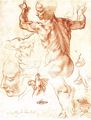
Michelangelo Buonarroti
Study for the Libyan Sibyl
Sistine Chapel – 1508-10
Arguably it was not until the late 17th century that artists began to be sought out primarily for their individual works, their style, or their fame. Artists had begun to offer landscape, still life and genre paintings to the rising merchant classes, and such works began to be the source of artists’ incomes. Prior to this, artists were engaged or commissioned by their patrons, guilds, or municipalities for very specific purposes, such as the decoration of the homes of the aristocracy, or as donations to churches, banners, or portraiture that would enhance the reputation and serve the needs of the patron rather than of the artist. Artists were treated as tradesmen or craftspeople with a particular skill. Major commissioned works of the Renaissance served the purposes of the patron, not the painter, sculptor, or architect. The likes of Leonardo DaVinci (1452 – 1519) and Michelangelo Buonarroti (1475 – 1564) did complain about the vagaries of their patrons regarding both the commissions they were awarded (or not) and the payment they received (or not!)
Artists working before the 17th century were sought-after and had great fame in their own times, but neither had a “market,” nor were they asked to produce a work of art as a purely personal expression of their own individual creativity. Yet — interestingly — today no one would dispute the categorization of works produced prior to that time as “fine art.”
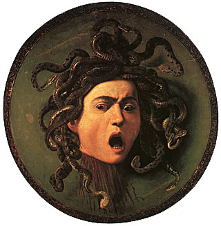
Michelangelo Merisi da Caravaggio
Testa di Medusa
c. 1597 (Uffizi version)
A 16th century example of a work of art that today we would consider that of an undisputed fine artist is the Testa di Medusa, dated 1597. It is a parade shield commissioned of Michelangelo Merisi di Caravaggio (1571 – 1610) by patron Cardinal Francesco Maria Bourbon del Monte as a gift for Ferdinando I de’Medici, Grand Duke of Tuscany. This work is a painting in oil on canvas covering a round wooden panel and exists in two versions, one in the Uffizi and one in a private collection. It is a classic case of the artist as craftsman, employed to create a work not as a personal artistic expression, but for a practical (albeit ceremonial) use and as a showpiece to symbolize the power of the Grand Duke’s family. Artwork such as this was commissioned for carrying and display in a parade or civic event rather than as a work of art to hang on a wall. Caravaggio was nothing if not a highly individual and willful character, but he was clearly still considered as fundamentally a tradesman by his patron.

Paul Rand
Logo for IBM
1972
Today, few would deny that creativity is a key component of the practice of graphic design. Designers at the highest levels have been sought out and commissioned by clients on the strength of their individual styles, the clients seeking not an anonymous product of the design process, but rather to acquire or partake of a given specific designer’s fame and personal style for the sake of the promotion of their businesses. One example is the now more than 40 year old design of the logo for IBM, which was specifically commissioned of the undisputed luminary and master of graphic design of the 20th century: Paul Rand (1914 – 1996).
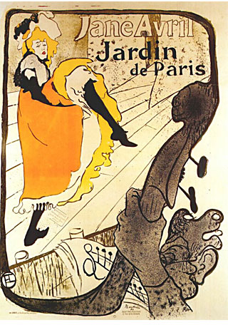
Henri de Toulouse-Lautrec
Poster – Jane Avril, Jardin de Paris
1893
Many artists have straddled the divide between the graphic and fine arts. To name but a few: Henri de Toulouse-Lautrec (1864 – 1901) was a painter, but he also produced posters, Andy Warhol (1928 – 1987) was an artist who took many a motif from the “mundane” world of product design, artist/activist Keith Haring’s (1958 – 1990) distinctive work also served to promote causes and would be considered both fine and “graphic” art even though he himself said that he did not want to be either an illustrator or a graphic designer.
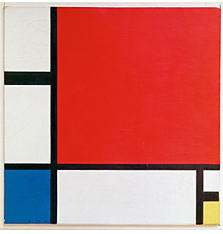
Piet Mondrian
Composition II in Red, Blue, and Yellow
1930
One (and only one out of many) of the most important direct influences of the fine arts on graphic design is that of the Dutch painter and theoretician Piet Mondrian (1872 – 1944), who was both a contributor to and a participant in many of the seminal artistic movements of the first half of the 20th century, most notably De Stijl and his own approach which he termed Neo-Plasticism. He is also associated with Color Field painting, Abstract Expressionism, and Minimalism. In his paintings, Mondrian rigorously explored the purest expression of abstract (non-representational) compositional balance that was to be had in two dimensions. There are few artists whose style has been more “co-opted” by popular culture to the point of its influence on product, fashion design, and even architecture. His echoes are seen everywhere.
Since most graphic design takes place in two dimensions, whether tactile or digital, compositional balance is a fundamental element of all graphic design. Confining Mondrian’s massive contributions to the area of graphic design, today he is recognized as the original inspiration for what came to be known among designers as the “Grid System.” The seminal, though now transcended notion in the design world propounded an invisible grid that would underly the structure and foundation of the page layout. There remains a great deal of influence of this concept not only in print but also in web design. The grid forms a framework of columns and rows, but these can be far from symmetrical or restrictive. To quote Josef Müller-Brockman (1914 – 1996), the Swiss graphic designer and author of Grid Systems in Graphic Design, “The grid system is an aid, not a guarantee. It permits a number of possible uses and each designer can look for a solution appropriate to his personal style. But one must learn how to use the grid; it is an art that requires practice.” Designers who are familiar with this concept seek to achieve Mondrian-like balance in their work. When a design is well-balanced it has an extra quality to it that is perceived by the viewer, even if not consciously.
Skill in balanced composition is an art in and of itself, and by “balanced” we frequently not do NOT mean merely symmetrical. Creative and powerful use of asymmetry, and of “negative” or “whitespace,” or the balanced interplay of the elements in a layout can “make or break” a design. The ability to compose at this level separates the merely informational from the compelling. Asymmetry is a compositional balancing act that creates tension, energy, and dynamism. It can direct the eye of the viewer in new and unexpected ways. Elements of all layouts (whether symmetrical or asymmetrical) form relationships by virtue of their size, positions, proportions, colors, and visual “weight.” Some elements can attract or cling to each other while others seem to recede or create visual “tension,” or a counterpoint on the page. Composition is one aspect of design that holds great fascination both for designers and for the viewers and end-users of a design. It is key to holding and directing the viewer’s attention, and can be a powerful tool in the right hands.